Case study · Onez.io
One wallet. 15+ brands.
How I turned a crypto wallet into a white-label platform. Each new client got a fully working app in its own brand in 2 to 4 weeks, without forking the product.
White-label
Web3
Wallet
Product strategy
Design system
Role
Senior Product Designer with product ownership
Clients
NoBanka, Qadirah, Binary, Vaultex, Afrex, Sdefi + 9 more under NDA
Launch
2 to 4 weeks per client
Team
5 people
Period
2023 to 2024
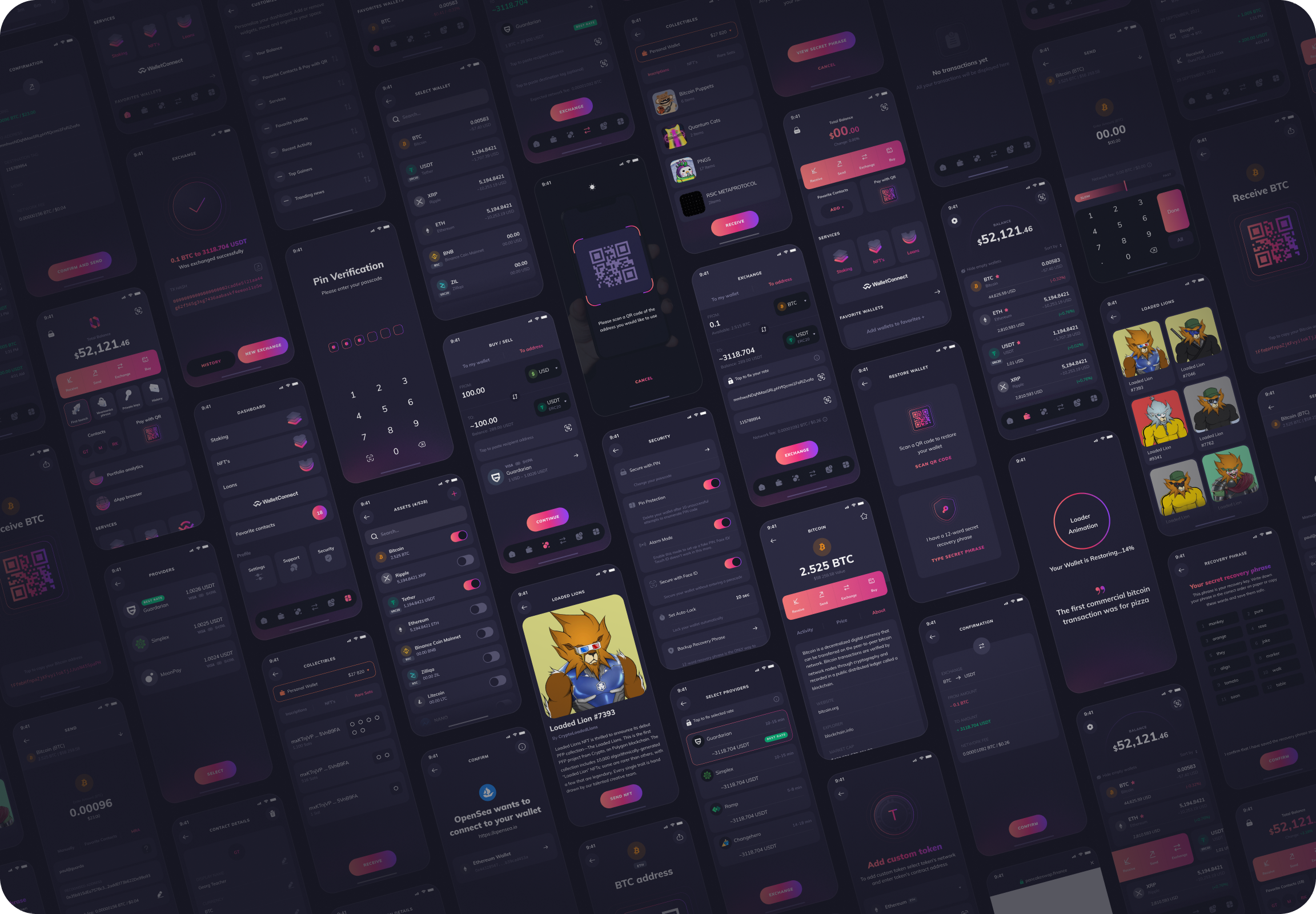
One structure, every client’s brand.
The problem
Every new client wanted “their” wallet
A white-label wallet serves two audiences with opposite needs. If every client request became a custom screen, we would end up maintaining 15 slightly different wallets. Every fix and every feature would cost 15 times more, and quality would drift where it matters most: in transactions.
The client
A fintech, an exchange or a DeFi project that wants a wallet in its own brand, with its own assets, networks and payment partners.
The end user
Someone trusting the app with real money. They don’t care whose logo is on top, but sending, receiving and recovery must be clear and predictable.
The question I set for the team
How do we let each client feel the product is theirs, while keeping one wallet underneath that we improve once and ship to everyone?
The strategy
Three layers, one product
I split the product into three layers and agreed with the business on one rule: clients can change the top two layers, never the core. Every client request became a simple question: is this a brand change, a configuration change, or a real product change?
Brand layer
How it looks
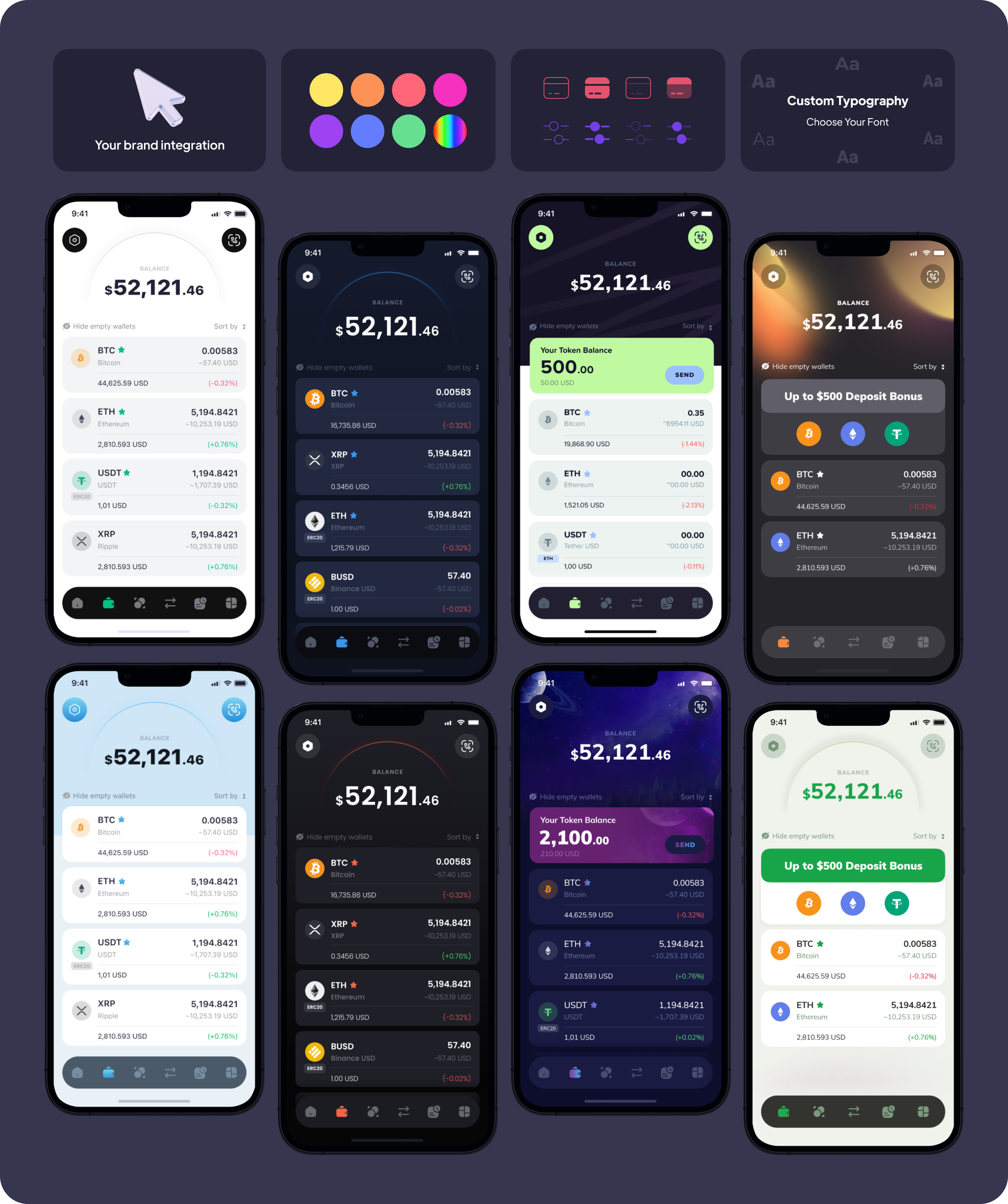
Logo, colour palette, light or dark theme, fonts, icon style, promo banners
Set per client
Configuration layer
What it does
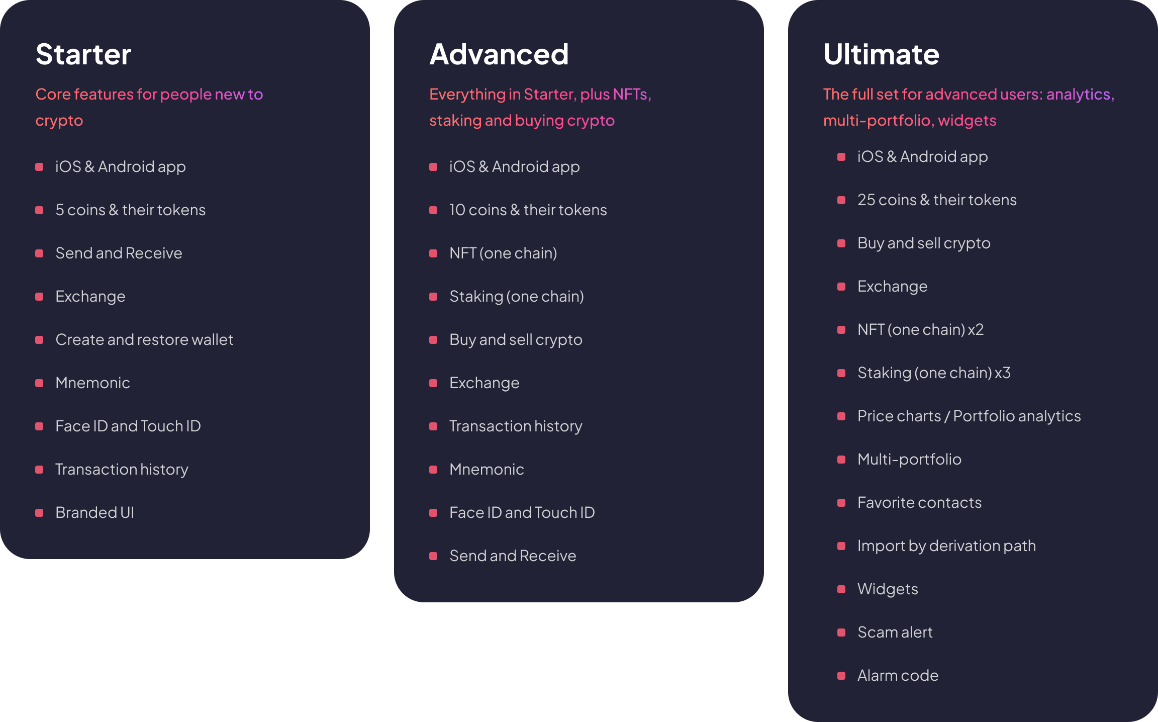
Starter, Advanced or Ultimate package, then a toggle per feature: staking, NFTs, buy and sell, widgets
Switched on per client
Shared core
How it works
Send, receive, swap, history, contacts, recovery and security, one component library
Same for every brand
A fix in the core ships to all 15+ wallets at once.
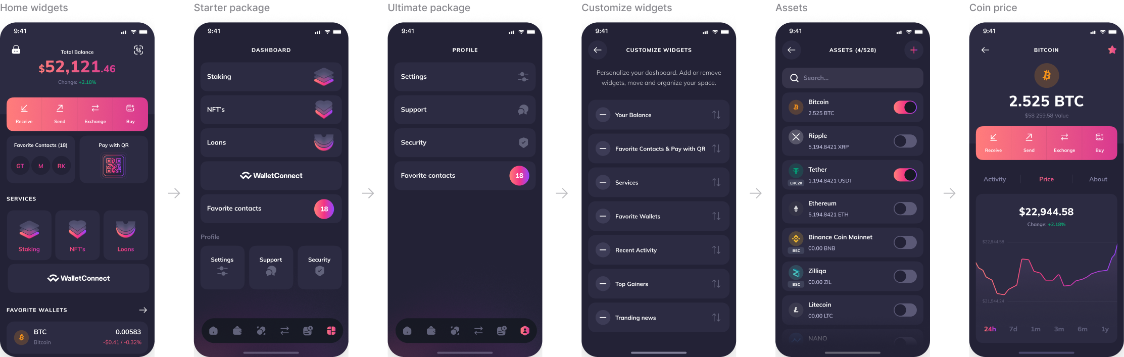
For configuration I designed three packages: Starter for newcomers to crypto, Advanced with NFTs and staking, and Ultimate for power users. On top of the package every feature has its own toggle, so a client switches a module on or off without a single new screen. Every screen had to stay complete with any combination.
Key design decisions
Five decisions behind one product for fifteen brands
01
The brand lives on the surface, the logic stays the same
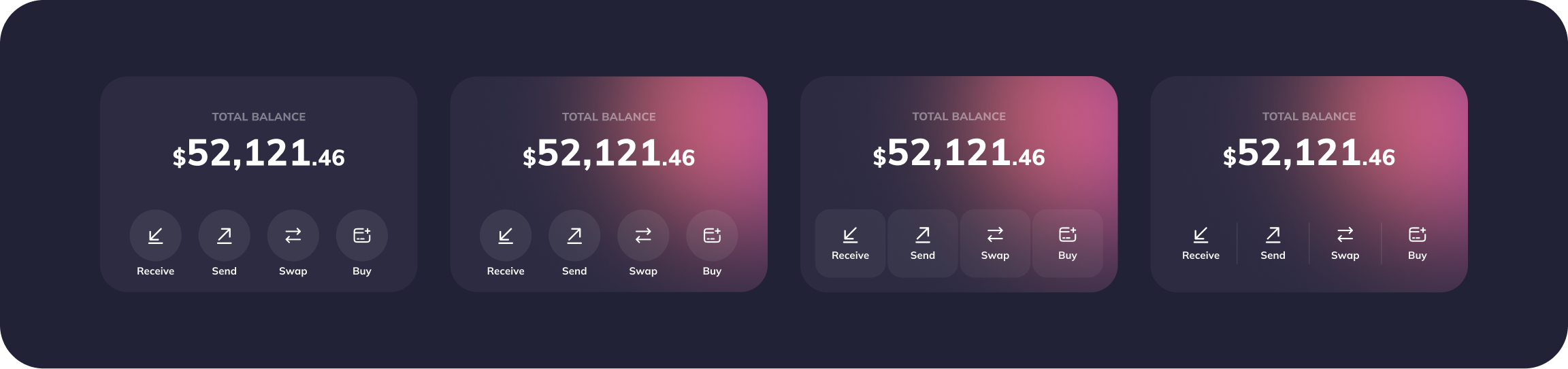
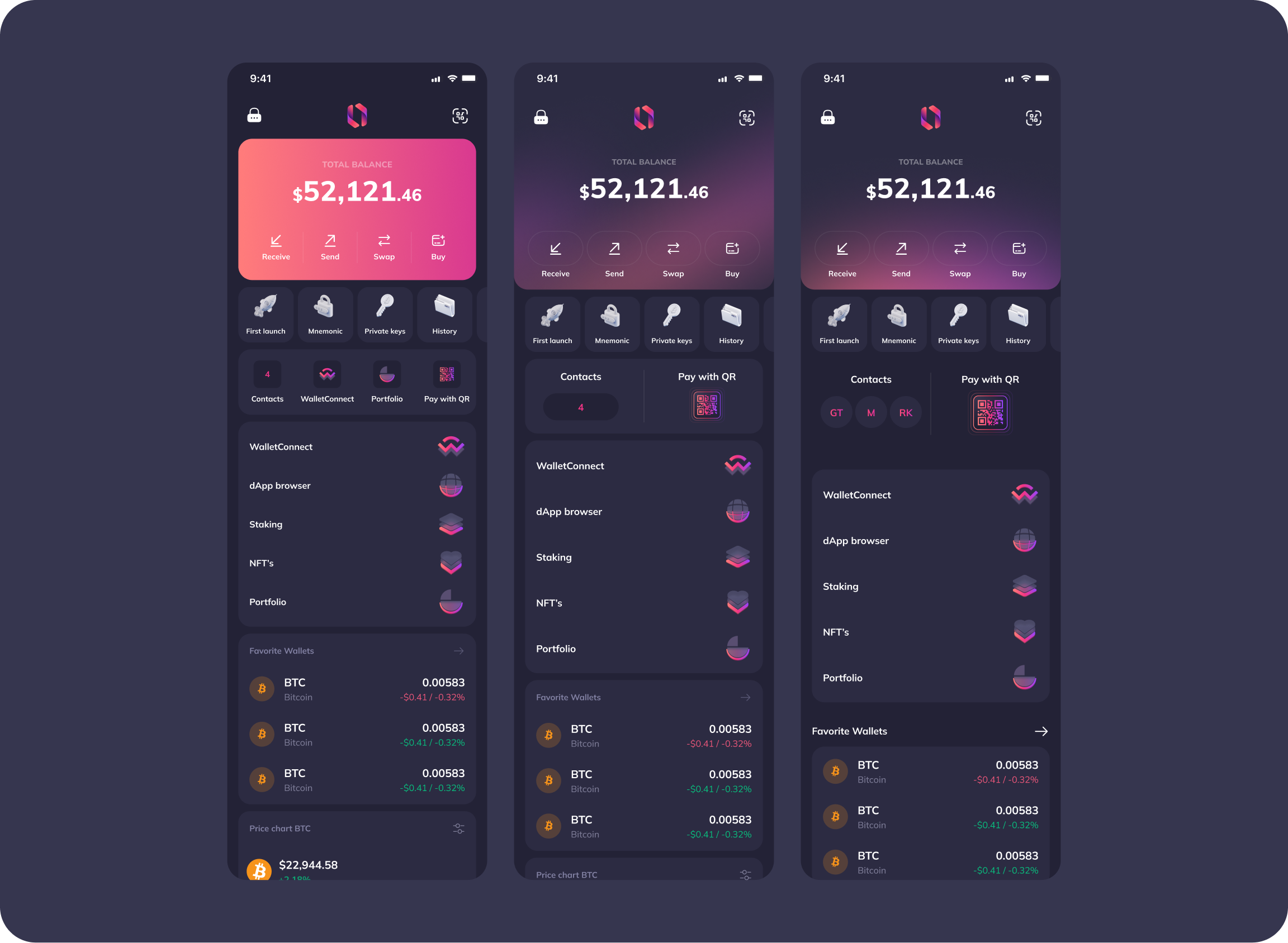
Each client could bring its colours, a light or dark theme, its fonts and icons, and even its own token or promo banner on the home screen. I explored the balance card and home in many variants until one structure worked for every brand, from clean white to neon dark.
Clients got a wallet that looks like their own. Users got send, receive and recovery screens that behave the same in every wallet, so branding never gets in the way when they check an address or a fee.
02
A home screen built from modules
Clients didn’t sell the same services. Some needed staking, others NFTs or WalletConnect. Instead of a home screen per client, I designed a stack of widgets: balance, contacts, pay with QR, services, favourite wallets, price chart, activity and news.
Each client turns on the modules that match its business and the layout still holds. The same structure gave users a “Customize widgets” option, so one decision served both audiences.
03
A send flow that covers every state, once
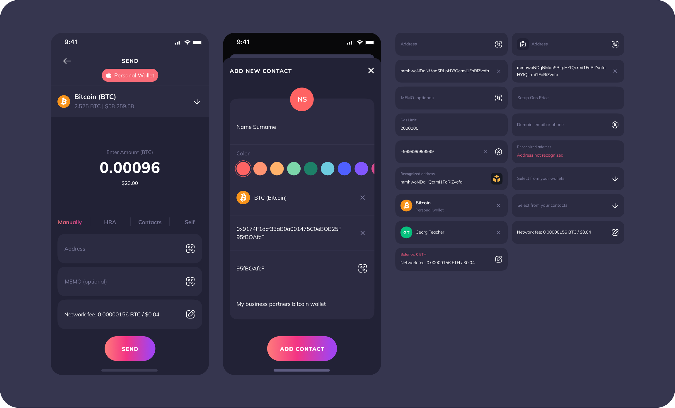
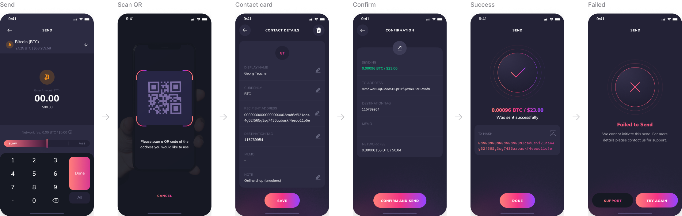
Sending crypto is where users lose money, so this is where I went deepest. The recipient field is one component with 17 documented states, from a pasted or two-line address to recognised and unrecognised addresses, memo, gas and network fee.
Four ways to pick a recipient sit in one control: manual address, human-readable address, saved contact or your own wallet. A zero fee balance state warns users who hold a token but not the coin needed to pay the fee, one of the most common reasons a transfer fails. Because it all lives in the core, every client got the same safety net.
04
Selling through providers, configured per client
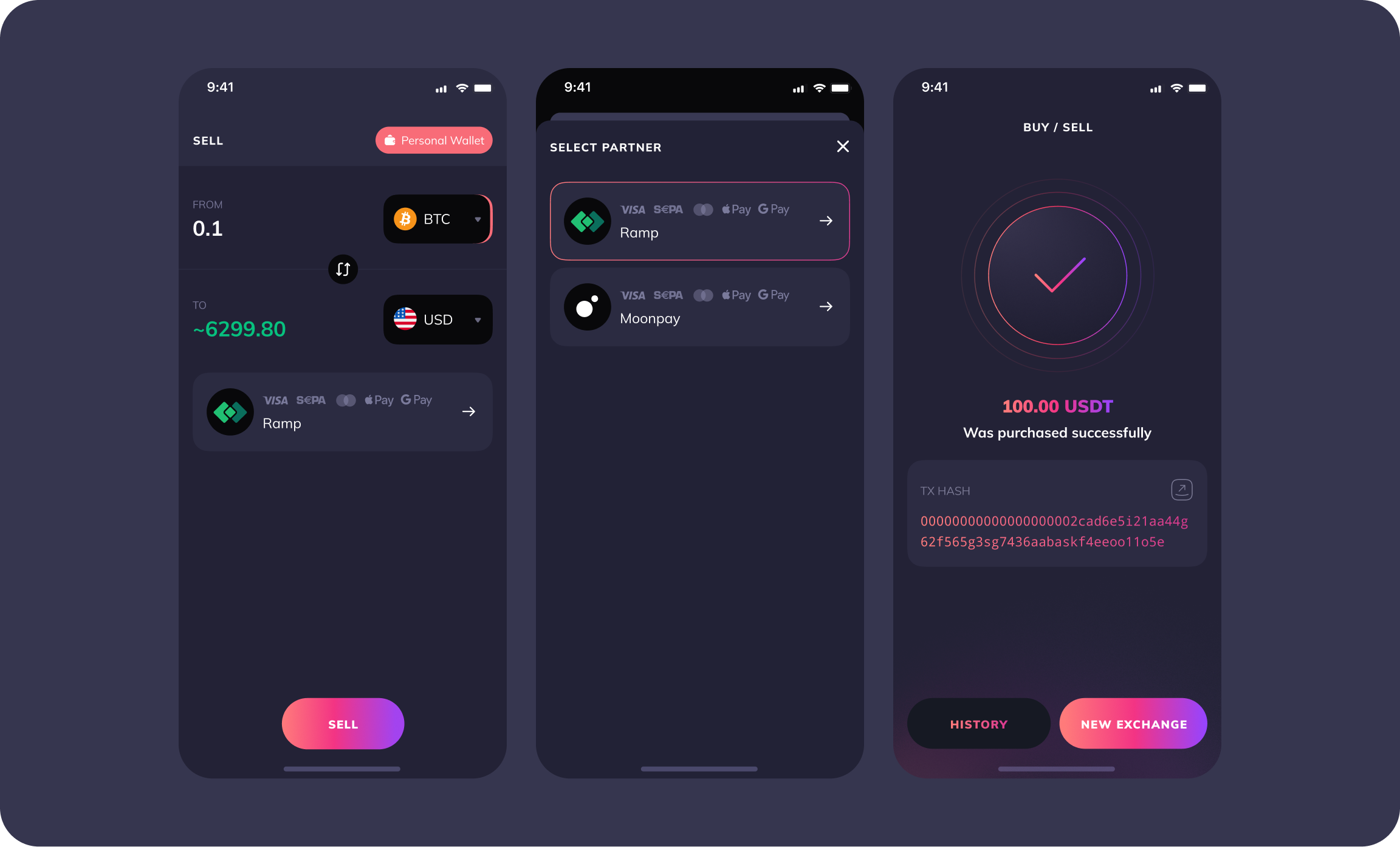
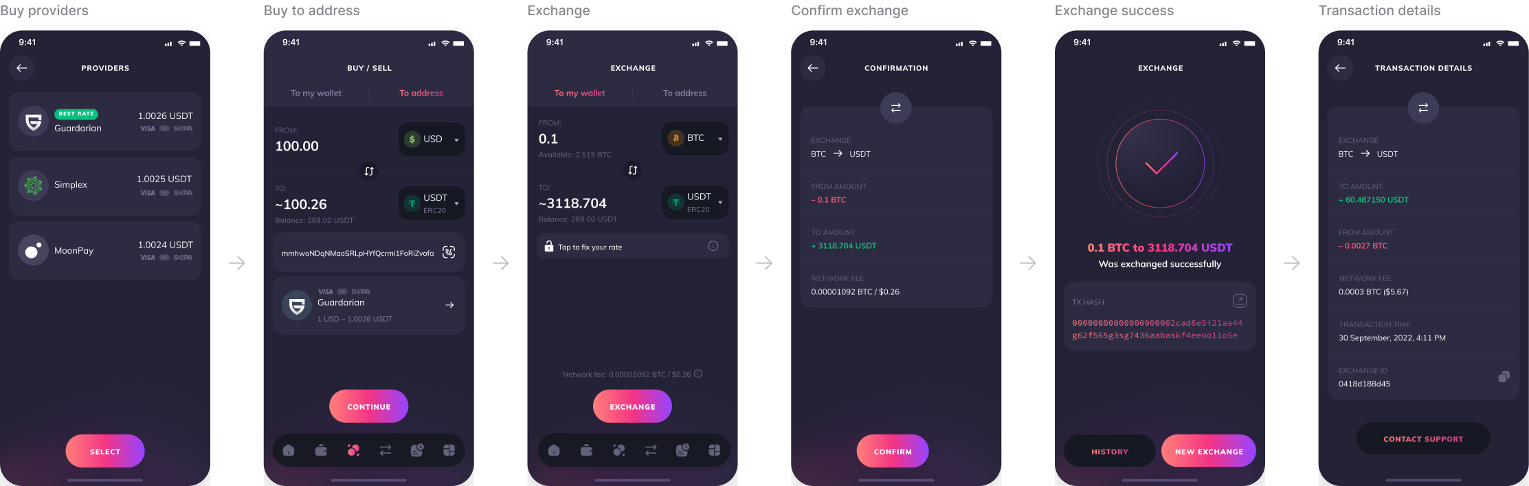
Cash-out depends on licences and regions, so the wallet doesn’t sell crypto itself. I designed selling as a provider choice: the user sees the amount and its estimated fiat value, then picks a partner such as Ramp or MoonPay. The provider list is part of the configuration layer, so each client shows only the partners available to it.
05
Crypto basics, taught on the home screen
Many clients brought users who were new to crypto. I added story-style covers to the home screen, each explaining one topic: first launch, recovery phrase, private keys, exchange, buying crypto, WalletConnect, staking, NFTs, spam filter and watch-only wallets. Clients reused them as they are, which removed a whole category of onboarding requests.

Beyond mobile
Same core, every surface
The rules that kept 15 brands consistent also kept three surfaces consistent. Desktop reuses the mobile flows and components, and the website sells the same white-label promise to businesses.
Mobile app
iOS and Android, 300+ screens in the shared core.
Desktop app
The same flows and components, adapted to a wide window.
Website
The storefront that pitched each product to businesses: “Get your own brand wallet”.
Onez Wallet · Mobile app
Core flows every brand shipped
Six flows from 300+ screens. Everything here lives in the shared core: clients changed the colours and switched modules, never these flows.
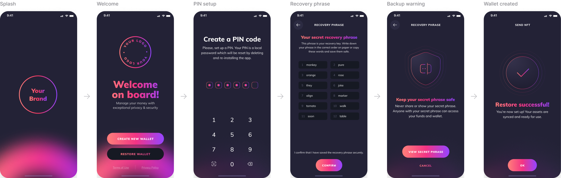
Onboarding
From first launch to a backed-up wallet in six steps.
Home and packages
One modular home. Clients pick Starter, Advanced or Ultimate, users customise the rest.
Send
Every state covered once, in the core, for every brand.
Buy and exchange
Providers and rates are configured per client, the flow stays the same.
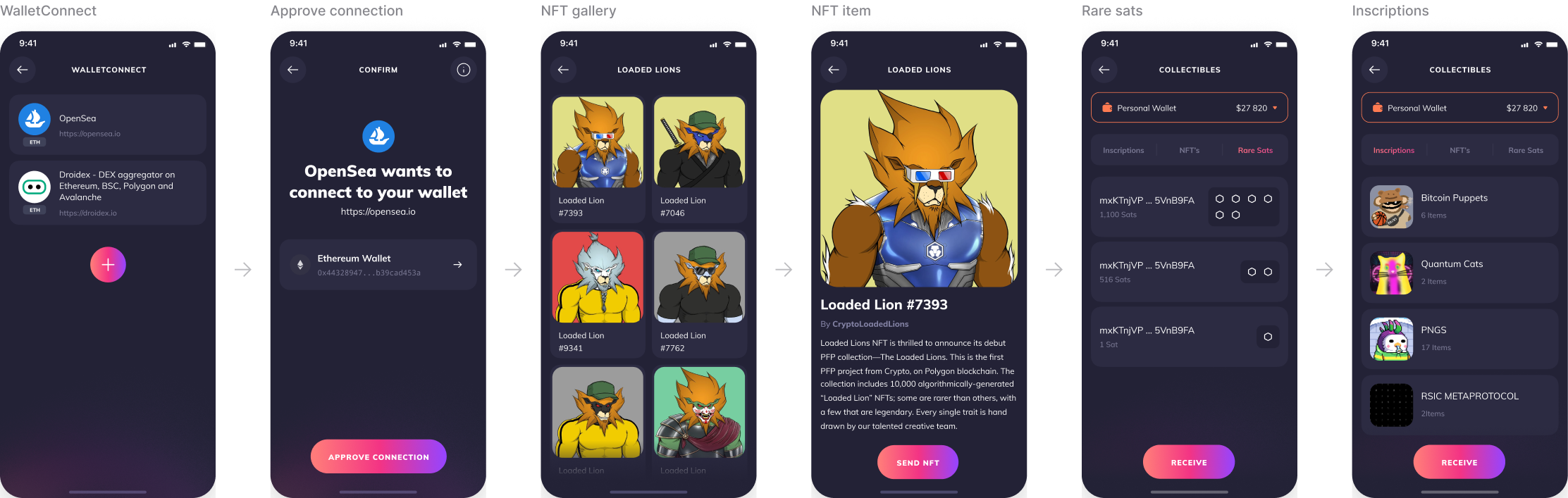
Web3
Modules a client switches on: WalletConnect, NFTs and Ordinals.
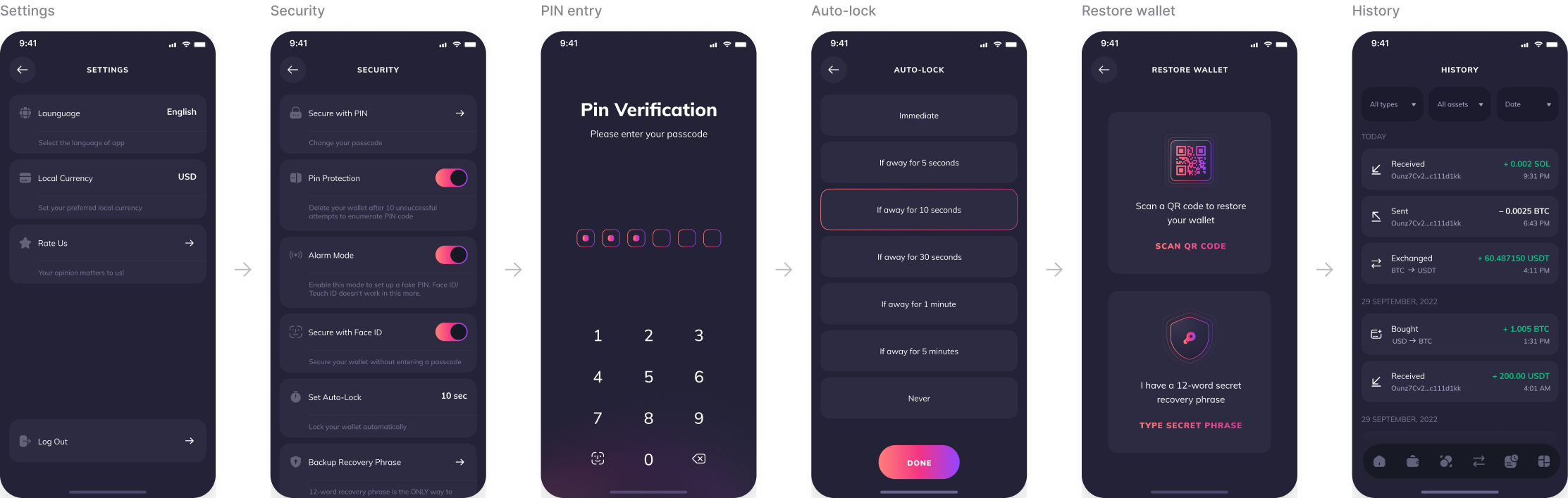
Security
The part no client can change: PIN, auto-lock, recovery.
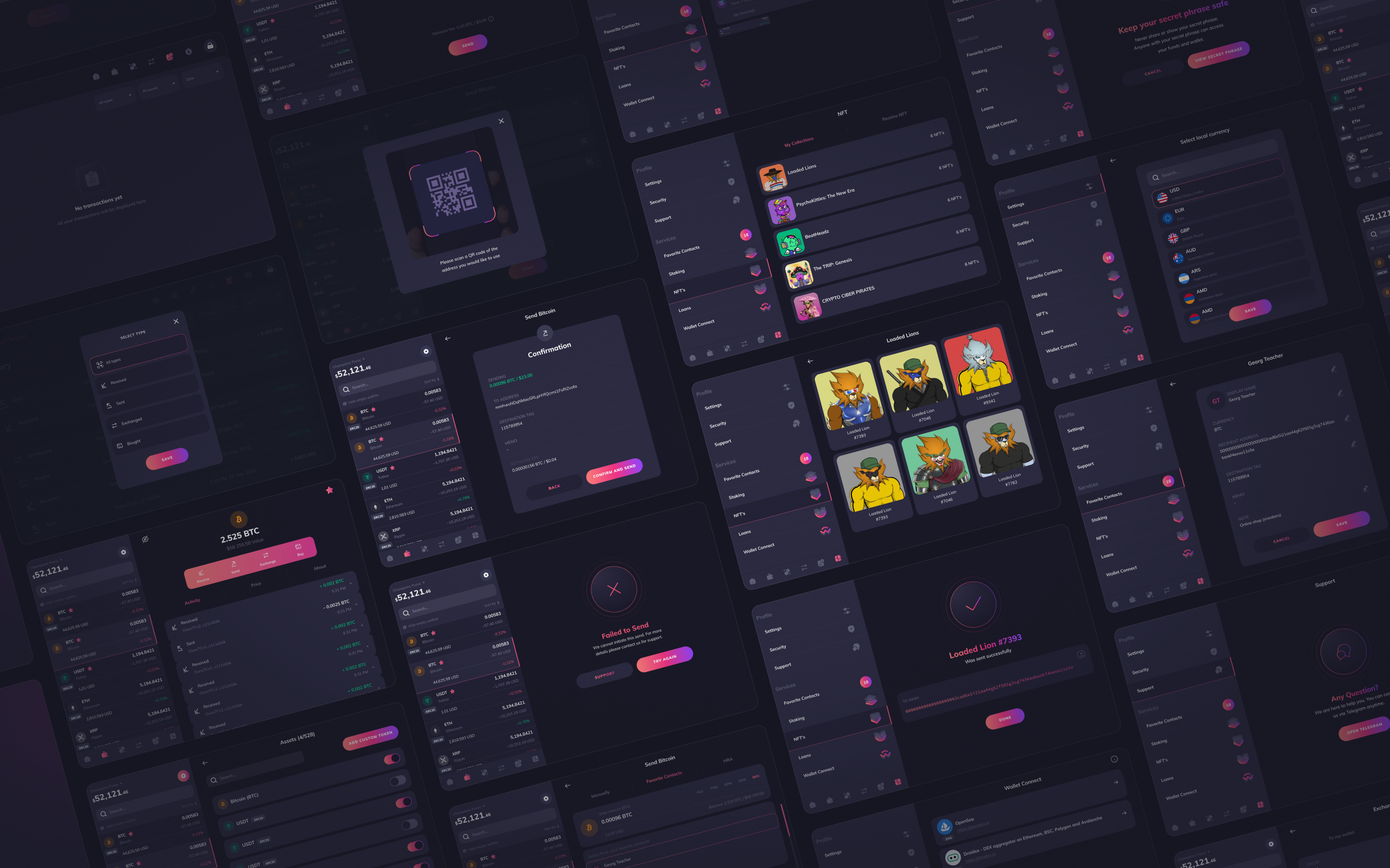
Onez Wallet · Desktop app
The same core, on a bigger screen
Every desktop flow reuses the mobile logic and components, adapted to a wide window. One rule set, two platforms, every client brand.
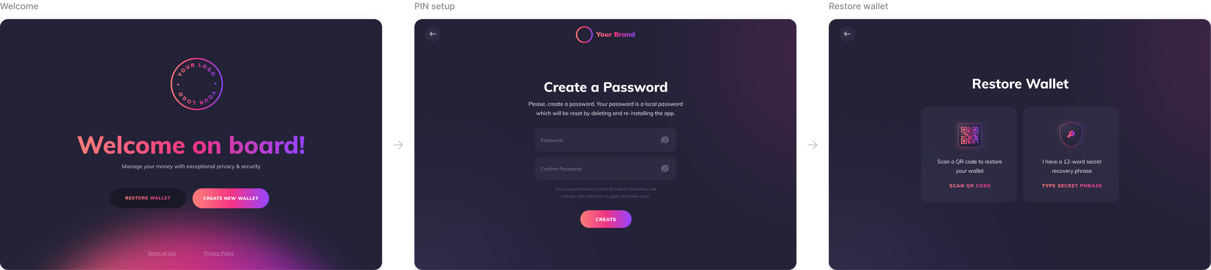
Start and restore
Create or restore a wallet in a few steps, protected by a PIN from the first screen.
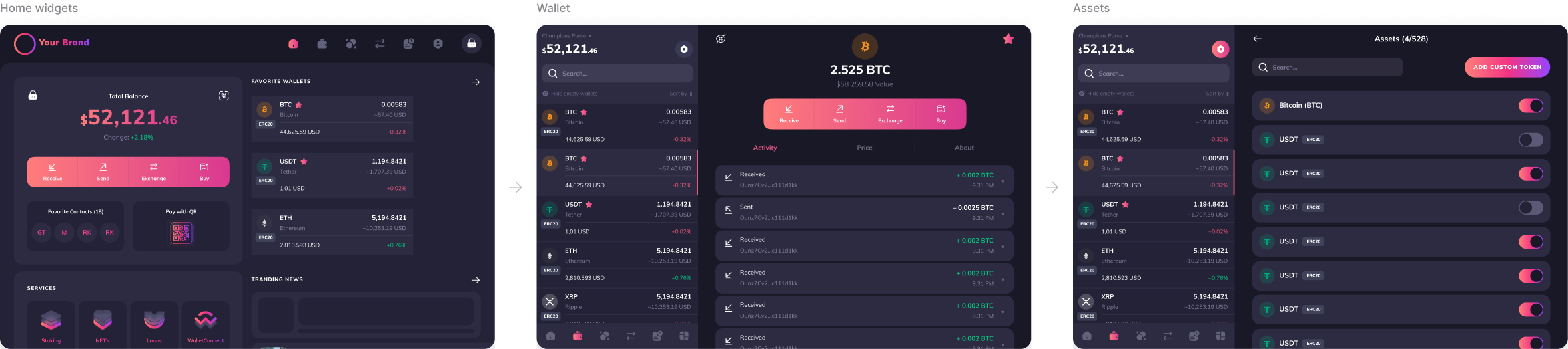
Home and wallet
The same modular home and asset list as mobile, laid out for a wide window.
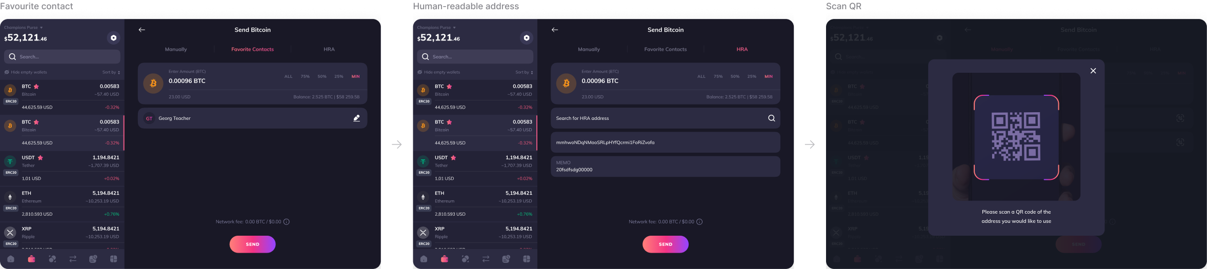
Send
Favourite contacts, human-readable addresses and QR, the same rules as on mobile.
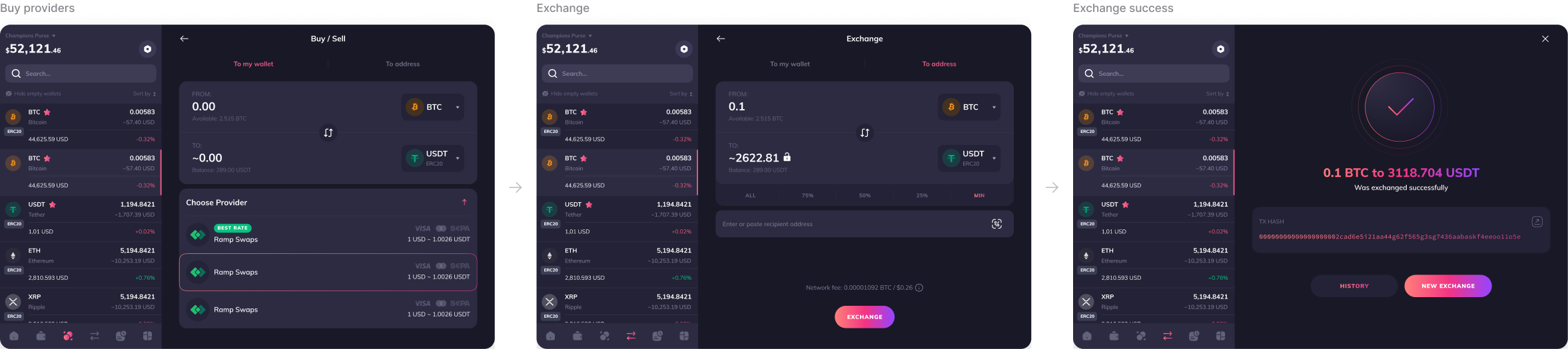
Buy and exchange
Providers and rates come from the client configuration.
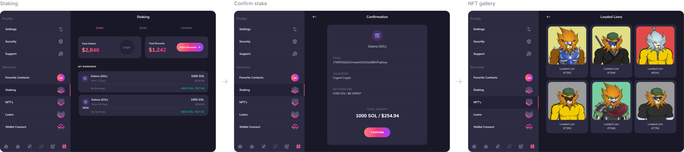
Staking and NFTs
Modules a client can switch on for its users.
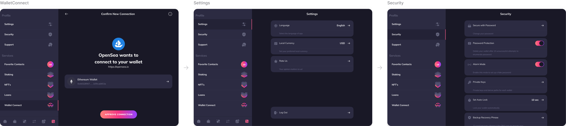
Connect and secure
WalletConnect for dApps, settings and security in the shared core.
My role
Owning the product, not just the screens
Holding both roles meant I didn’t hand designs to someone else to defend. I decided what went into the product and then designed it. We were a team of five: me, a frontend developer, a software engineer, a project manager and a business developer who brought in the clients.
Client request triage
Every request was sorted into brand, configuration or core. Most turned out to be configuration, which kept the core clean.
Release planning
Core improvements grouped into regular releases, each shipped to every client wallet at once.
Design system
One master component library behind every brand, so a new client meant new tokens, not new screens.
Engineering hand-off
Every flow came with its full set of states, so developers never guessed edge cases per brand.
Outcome
What it delivered
15+
client brands launched, none of them a fork
2 to 4
weeks from a signed client to a working wallet
3
packages plus a toggle per feature
1
shared core across mobile, desktop and web
What I learned
White-label design is a product architecture problem first and a visual problem second. The most valuable thing I designed wasn’t a screen, it was the line between what a client can change and what stays the same. Once that line was clear, saying no to clients got easier, because the answer was a principle, not an opinion.