Case study · Blanc bank
From tariffs to subscriptions.
How I helped a business bank replace its complex tariff constructor with subscriptions for entrepreneurs, and raised average commission income per client by 16%.
Fintech
B2B banking
Monetization
UX research
Mobile and web
Role
Senior Product Designer
Product
Blanc, a bank for entrepreneurs, 6.5–7k MAU
Team
Payments and financial services: PM, analyst, engineers
Platforms
iOS, Android, web
Period
2023 to 2024
The problem
A tariff constructor that cost everyone
Blanc serves sole proprietors, LLCs and the self-employed. Its tariffs let clients build their own set of options. In practice the constructor hurt both the bank and its clients.
For the bank
Expensive to sell
Clients paid a little less for the constructor than for a full tariff, used one option and treated Blanc as a backup bank.
Expensive to maintain
Three tariffs turned into dozens of option combinations. 6 and 12-month periods multiplied them again.
No room to grow
Adding payment periods on top of the constructor would have broken it.
For entrepreneurs
Hard to know the real price
Instead of one monthly fee, a client paid three: one for each option.
Too many choices
A long canvas of options confused people. They wanted fewer choices and a faster decision.
The challenge
Every bank in the market sells tariffs with limits. How do we sell a subscription to entrepreneurs used to that pattern, and do businesses even want one?
The plan
Two iterations, one shift in thinking
Together with the product manager we split the change in two, so clients could get used to the new logic before paying for more.
Iteration 1
Redesign the navigation and logic of tariffs and introduce discounted 6 and 12-month periods.
Iteration 2
Turn tariffs into subscriptions with benefit packages: extra services, lower fees, higher deposit rates.
Goals
Grow net commission income per client about 1.5 times.
Shift clients towards longer, richer subscriptions.
How we measured it
Net commission income per client.
Clients who changed their subscription on their own.
Clients on 6 or 12-month subscriptions.
Iteration 1
New tariff logic and payment periods
01
Start with how people use the current screen
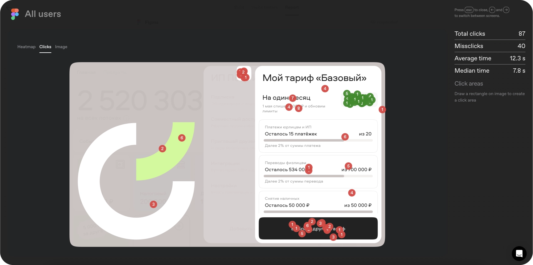
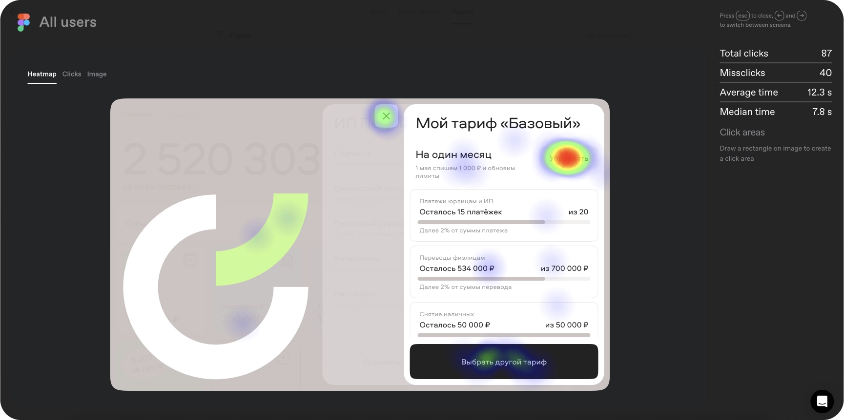
Before redesigning I ran unmoderated UX tests on the existing tariff screen. Click maps showed how entrepreneurs read their tariff, limits and fees, and gave me a baseline to compare the new design against.
02
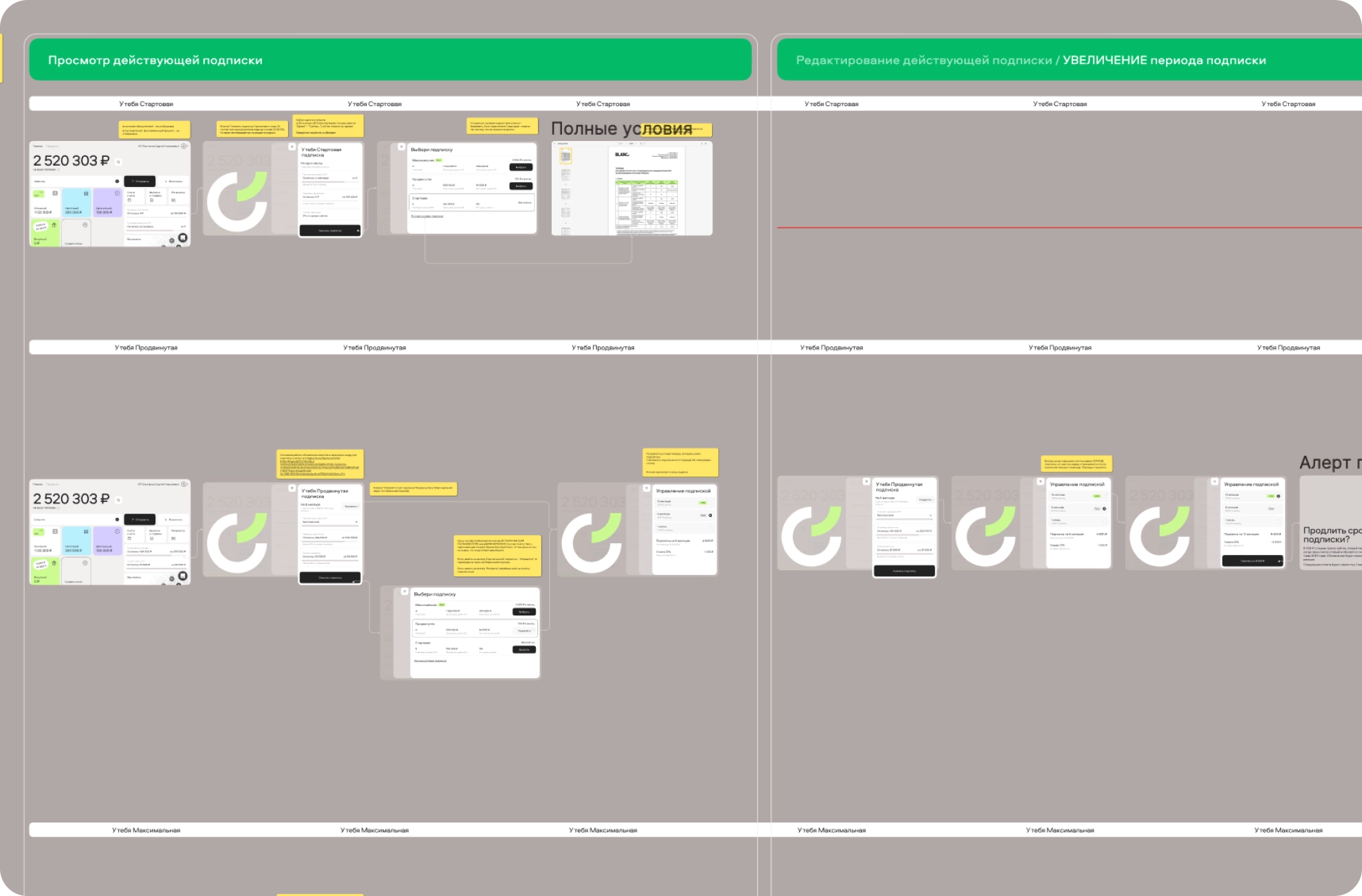
Change a subscription in two steps
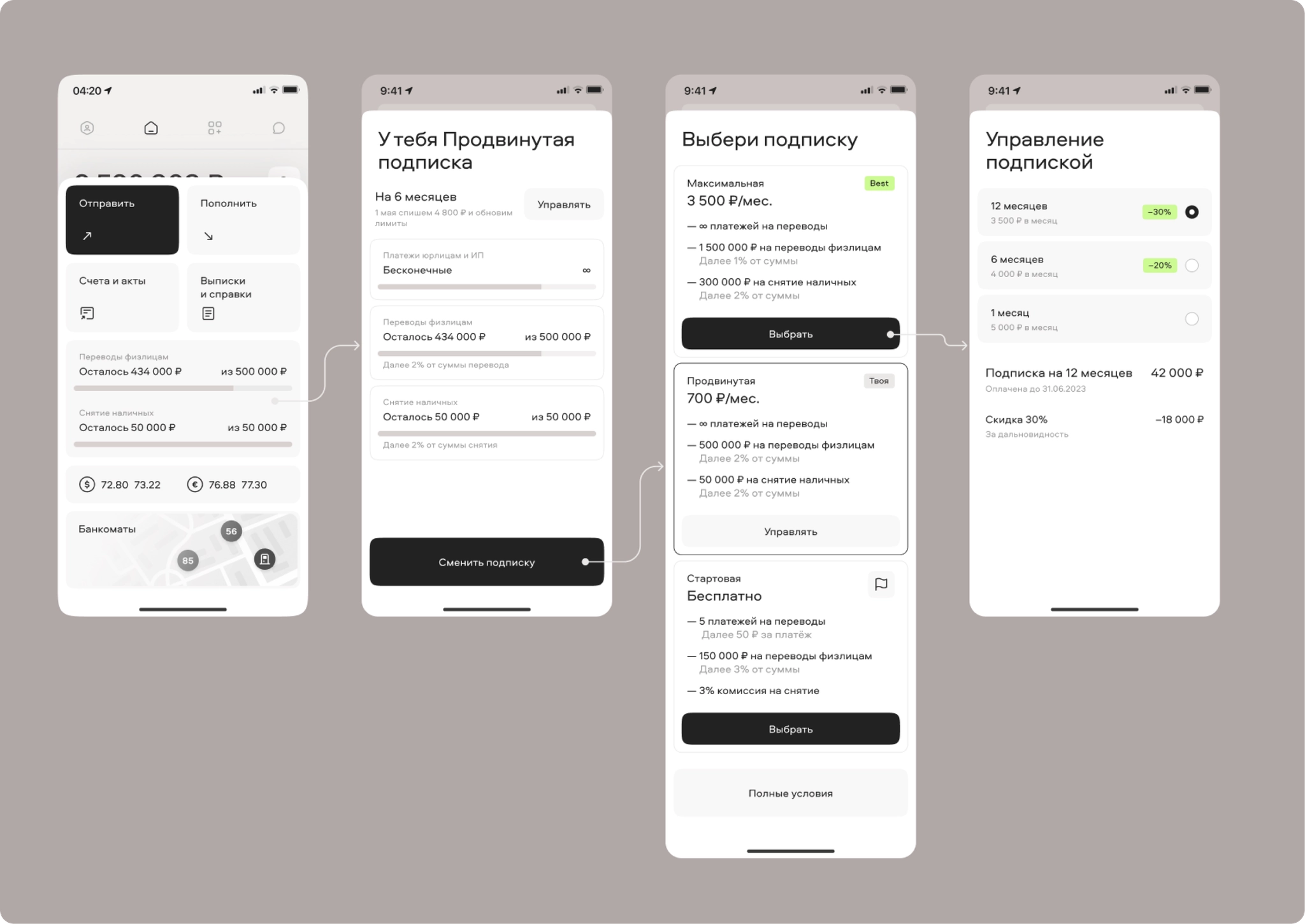
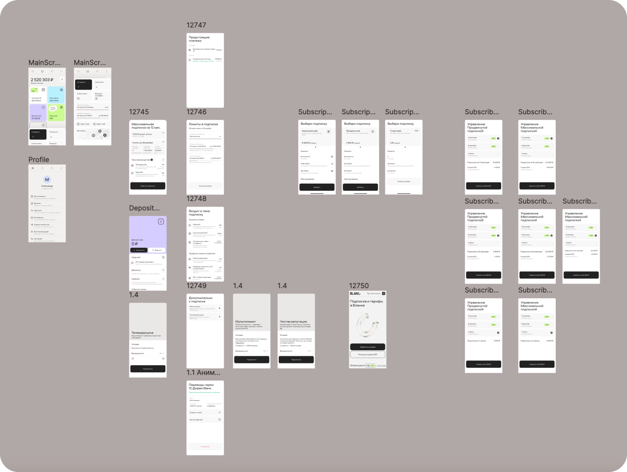
Customer interviews showed how easy it is to get lost in competitors’ conditions. In the new flow a client opens their subscription from the home screen, picks a new one and chooses a period, with the 6 and 12-month discount shown upfront. Each step went through a quick unmoderated test before development.
03
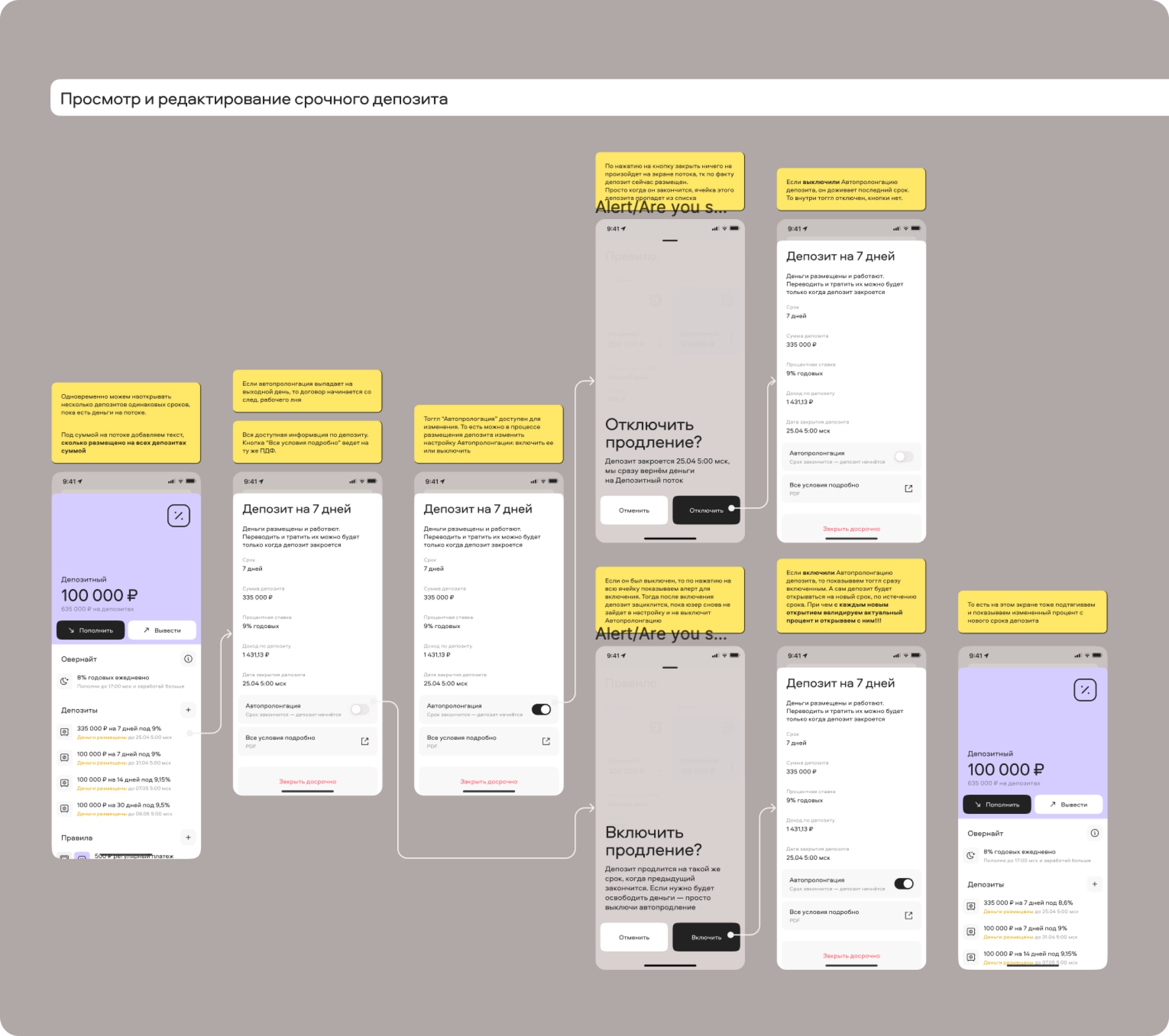
A scenario table for 40+ corner cases
The old tariffs carried years of legacy cases. Together with the analyst I worked through more than 40 of them so that every client could migrate to the new system safely. To keep it manageable I designed a scenario table that maps each condition to its screen.
Shipped
First iteration live on mobile and web

Iteration 2
Subscriptions people understand
04
Research before the redesign
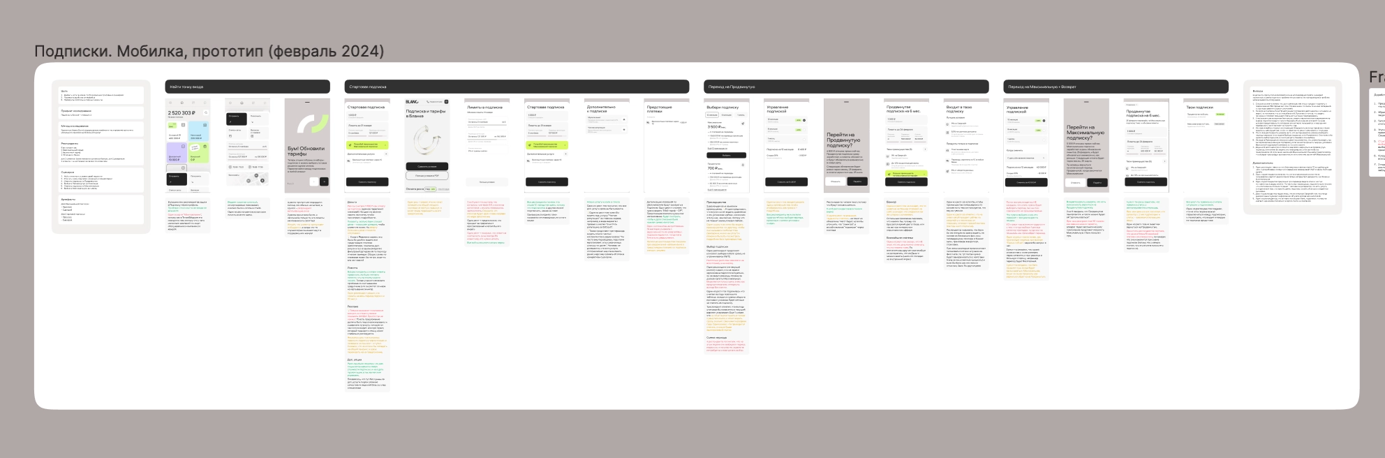
The second iteration touched the whole bank and had many stakeholders, so I started with research: in-depth interviews and custdev with clients of Blanc and other banks, plus unmoderated quantitative tests. I built a Figma prototype covering most subscription cases, wrote the script and hypotheses, then turned the findings into insights prioritised by impact and effort.
Key insight
“We are entrepreneurs. If we can’t see why we should pay, we choose free.”
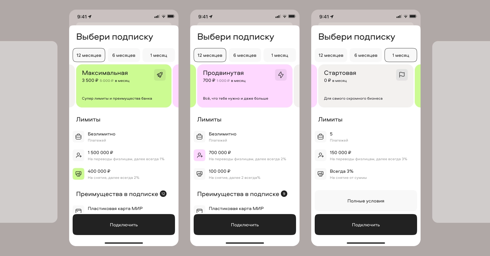
Users didn’t see the difference between subscriptions or the benefits of paying more.
05
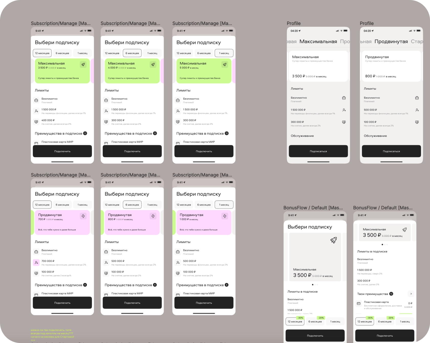
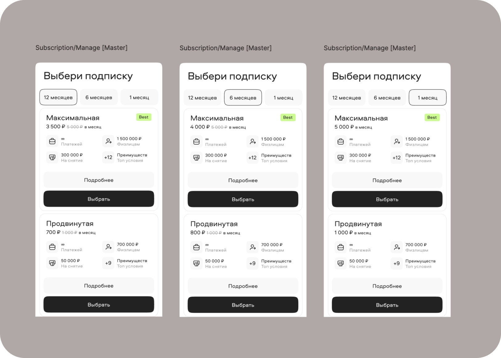
Making the difference visible
I wanted to rebuild the subscription selection screen around clear differences and benefits.
06
A compromise that shipped
We still didn’t know whether clients would pick a subscription in the app or on the website, so a heavy build was a risk. I proposed a lighter concept that kept the critical research findings and met the business requirements. The final concept is approved at C-level.
My role
Research, design and the system around it
I owned the design of subscriptions end to end and worked closely with the product manager and analyst. Beyond the task itself I organised the team’s design process.
Research
Custdev, in-depth interviews and unmoderated UX tests with clients of Blanc and other banks.
Prototyping and UX tests
Figma prototypes for every key case, tested before they reached development.
UX/UI design
Mobile and web flows, including 40+ migration corner cases.
Stakeholders
Aligned many decision makers across the bank, up to C-level.
Process
Master files that doubled team speed
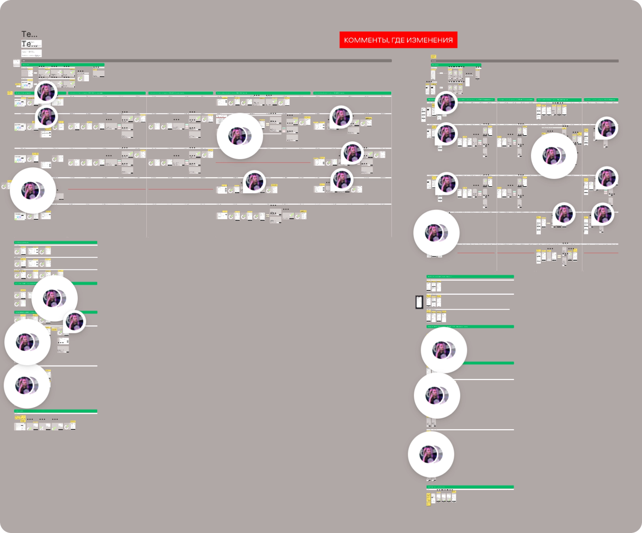
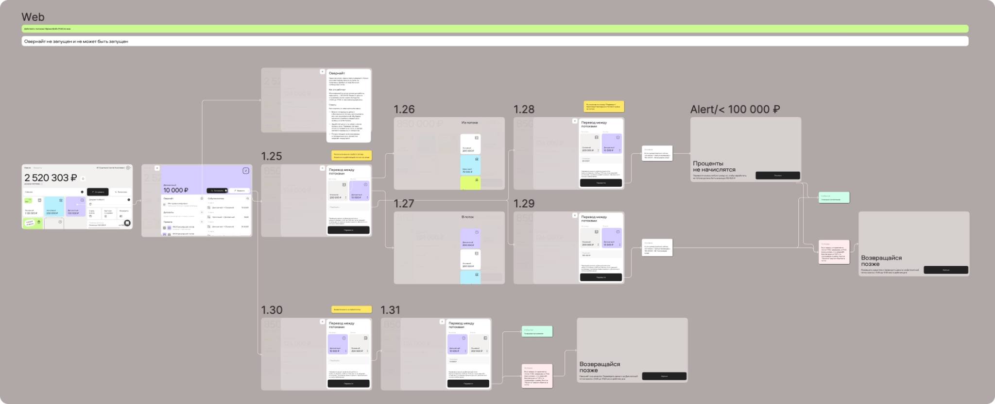
I built master files for mobile and web that collect every scenario of the banking app with simple navigation, plus instructions on how to use them. The team exchanged up-to-date versions faster and worked about twice as fast, which mattered most while the app was blocked in the App Store.
Outcome
What it delivered
+16%
average commission income per client, from 6 and 12-month subscriptions
40+
legacy corner cases migrated safely
2x
faster team work with master files
C-level
approval of the final subscription concept
What I learned
Changing how a bank makes money is mostly about edge cases and people. Every time the work felt finished, new legacy cases, limits or stakeholders appeared. What kept it moving was evidence: research findings and production data showing that more clients were choosing longer and more expensive subscriptions.